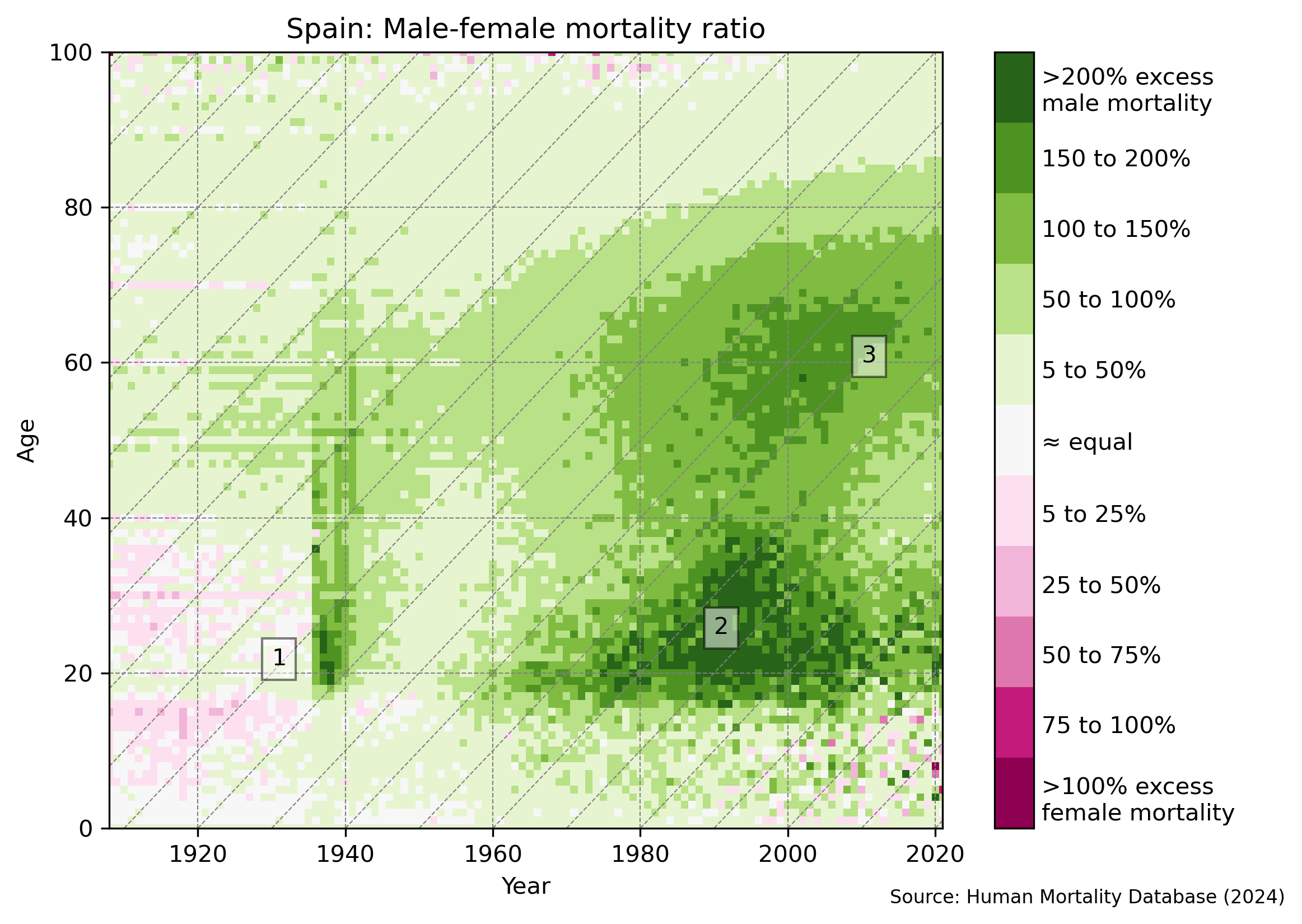
Lexis Diagram
I first encountered Lexis diagrams in a Reddit post. These diagrams are frequently used in demographic studies to visualize the relationship between age, time period, and cohort (year of birth).
As outlined by Schöley & Willekens (2017), the labelled patterns in the Lexis diagram below are predominantly linked to:
- The pronounced impact of the Spanish Civil War (and before possibly of World War I).
- The persistently higher risk of accidents among young men.
- Smoking-related deaths in men before women began to adopt similar smoking habits.